When is too much of a good thing a bad thing? That's the question that ponder while staring at this busy, busy ad until my eyeballs bleed. It's from the April 18, 1906 Bemidji Daily Pioneer and holy mother of God did they pack a lot of information into this 1/8 page advertisement. Where to begin?
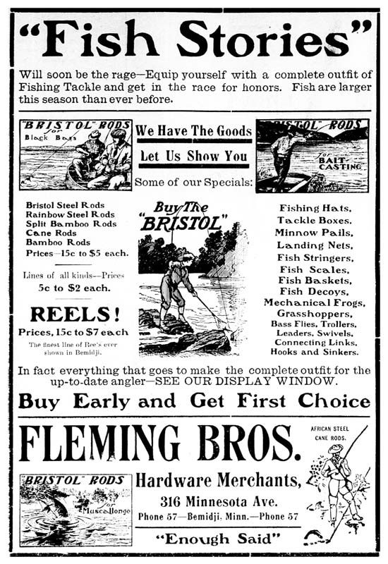
Let's start with the header and tag. "'Fish Stories' will soon be the rage" it screams in 64 point font, then says "fish are larger this season then ever before." Wow. Just wow.
There are no less than FIVE pictorials in this advert. Four of them were provided by the Bristol-Horton rod company, perhaps the leader in national advertising and well known to have supplied dealers with artwork for ads. However, each of these cuts were to support a SINGLE ad, not to be thrown together in a confusing mishmash of ink.
The Fleming Bros. leave nothing to chance--listing every single possible piece of tackle, from Fishing Hats to Grasshoppers and everything in between. It's like staring at a train wreck; you can't avert your eyes even if your brain can't possibly process what it is seeing. The fifth cut, interestingly enough, I believe is a Horrocks-Ibbotson one, which I also believe is put in simply to fill space. I love their tag most of all: "Enough said." Indeed, Fleming Bros., indeed…
I award this ad four fish for aesthetics and three fish for effectiveness. It makes me want to buy tackle, but it whips me into such a frenzy I'm willing to buy it from the first tackle dealer I run into on the street.
We move on to our next pictorial advertisement which is fascinating for any number of reasons. It's from The Paducah Sun and was run on June 6th, 1907. It is proof that--like almost everything--the ridiculous texting language of the youth of America is not new.
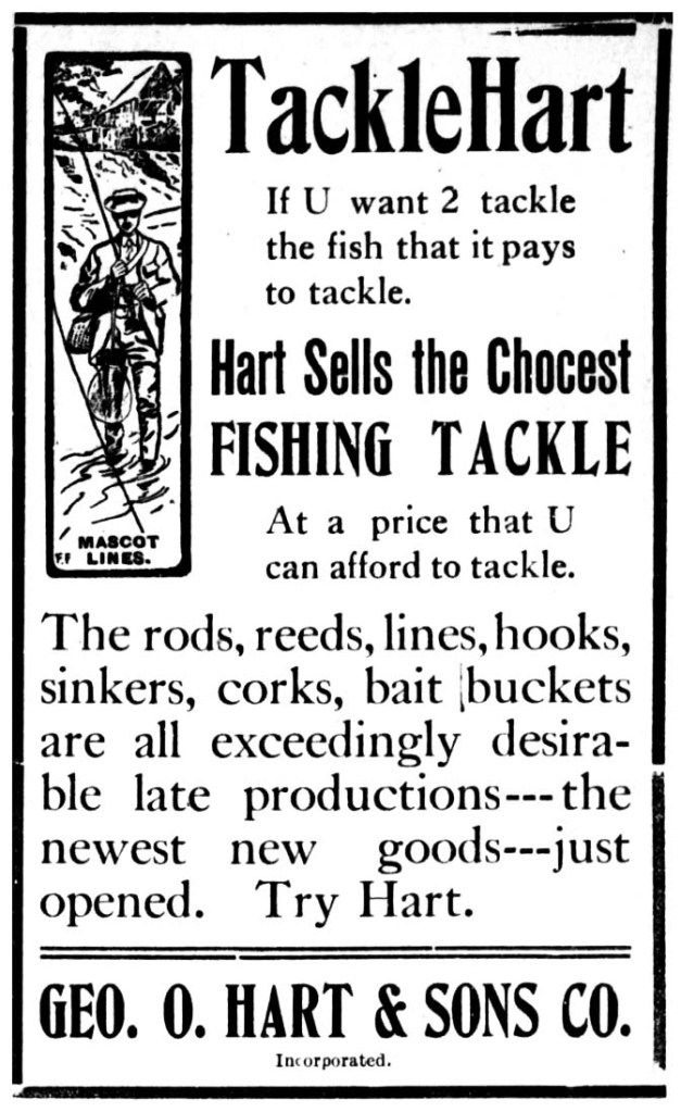
George O. Hart & Sons may have been fine merchants, but they were also prescient in the eeriest of ways. They crafted an ad over a century old that would work perfectly today, as long as it was aimed at the text-while-you're-driving under 25 set that seem to dominate the internet.
Let's begin with the text, shall we? "TackleHart if U want 2 tackle the fish that it pays to tackle. Hart sells the Chocest (sic) FISHING TACKLE at a price that U can afford to tackle." This could have been written by any of my pre-teen grandchildren and not seemed out of place. The annoying acronyms, the random misspelling, the butchered syntax…it's just a perfect ad for today's crop of mindless simpletons.
What a waste of a great piece of lithography, too! That is a world class gentleman fly fishing there, with a proper suit and fishing hat and everything. It's like putting up a picture of a Rolls Royce and printing "If U wnt a SICK RIDE U have 2 try da ROLLLLLSSS, BOYYYYY!!!" It helps to put your hat on sideways when saying this.
Their final word is "Try Hart." No, thank you, I don't believe I will.
I award this ad three fish for aesthetics and one fish for effectiveness. It does not make me want to buy fishing tackle. It DOES make me want to kidnap a roving gang of texting slackers and forcibly induct them in the army.
Do you like racism with your pictorial fishing advertisements? That was my first thought when seeing this beauty from the Hopkinsville Kentuckian dated July 4th, 1911. But then I looked closer and thought maybe it isn't a grotesque representation of a Chinese boy, but rather a terribly rendered figure of a barefoot and slack-jawed yokel.
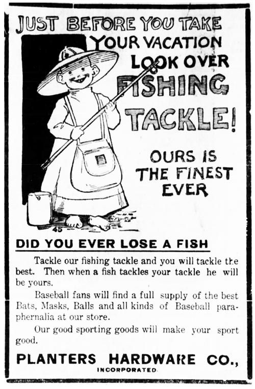
Planters Hardware Co. certainly wanted to make a splash with this advertisement, but I'm not sure this idea was thought all the way through. The text says their tackle is the finest ever, yet the pictures shows a slightly disturbing image of a child holding a cane pole (and, oddly enough, a creel).
Check out the copy: "Tackle our fishing tackle and you will tackle the best. Then when a fish tackles your tackle he will be yours." Tackle. Tackle. Tackle tackle. Tackletackletackletackletackle. Tackle.
I award this ad zero fish for aesthetics and zero fish for effectiveness. Not only does it not make me want to buy fishing tackle, it may very well give me nightmares.
Sometimes advertisers can be too clever by half. Here's a whimsical advertisement from the Matheson Hardware Co. of Westminster, South Carolina run in the Keowee Courier for May 13, 1914.
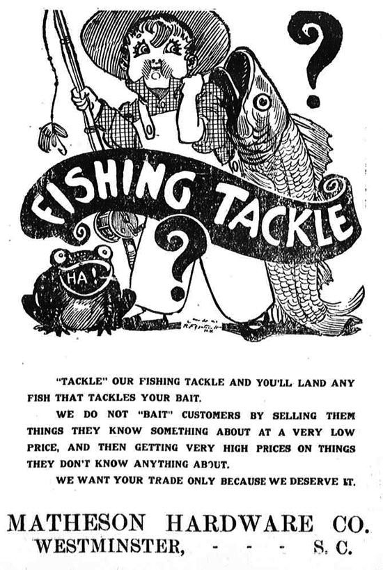
At least the child in this pictorial doesn't give me nightmares. It's a cleverly rendered image very much of its time, and comes from the "whimsy" school of advertising. Little kid, big fish, bullfrog, big banner saying fishing tackle.
I love how, despite the obvious nature of the image (did we REALLY need the "ha!" in the mouth of the bullfrog?), they had to put the words "tackle" and "bait" in quotes.
Despite everything I like Matheson's style, which certainly comes out in their copy. "We do not 'bait' customers by selling them things they know something about as a very low price, and then getting very high prices on things they don't know anything about." That's a fantastic line right there. And the tag? "We want your trade only because we deserve it." That is a man with chutzpah.
I award this ad five fish for aesthetics and seven fish for effectiveness. It not only makes me want to buy fishing tackle, it would make me feel guilty buying it from anyone else. Well played, Mr. Matheson, well played indeed.
Our final pictorial advertisement is a later one, dating May 15, 1920 and published in the Tulsa Daily World. It's from McHale & Co. Hardware and is the kind of simple and to the point advertisement that's always going to get my attention.
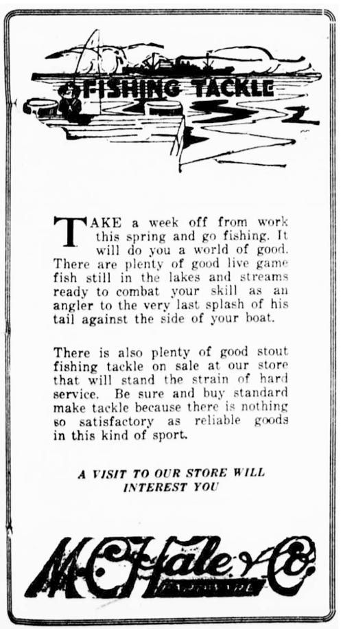
No hard sell here. McHale's copy is clean and literary and brings to mind warm late summer days with the smell of autumn wafting in from the range. "Be sure and buy standard make tackle because there is nothing so satisfactory as reliable goods in this kind of sport." Beautiful. Even their tag is outstanding: "A visit to our store will interest you."
Yes. Yes it would. I award this ad eight fish for aesthetics and eight fish for effectiveness. It makes me want to buy McHale's fishing tackle, and it makes me want to take that McHale's fishing tackle out on the water right after. We have ourselves a winner here.
That's it for the pictorial newspaper ads, although I have several hundred and may put them together down the road in to a little book if there is any interest.
Finn Featherfurd is the pseudonym of a sad and lonely retired professor and newspaper columnist who has spent the better part of the past four decades (unsuccessfully) chasing fish in the Lower 48. A long-time collector of vintage fishing tackle of all kinds, he is currently fascinated by pre-1920 children's fishing reels (40 yards and smaller). When the spirit moves him, he will contribute occasional pieces and essays to the Fishing for History Blog. He can be reached at finnfeatherfurd@yahoo.com.
No comments:
Post a Comment